

Most AI developer tools look nearly identical:
Dark backgrounds,
Blue and purple gradients,
Generic AI imagery,
Vague messaging.
As a result, many products fail to build trust with technical buyers.
The challenge was to create a brand that felt precise, reliable, and built by engineers.

A precision-first identity.
The visual identity was built around a single idea: Code review is about precision.
Every design decision reinforced that message.
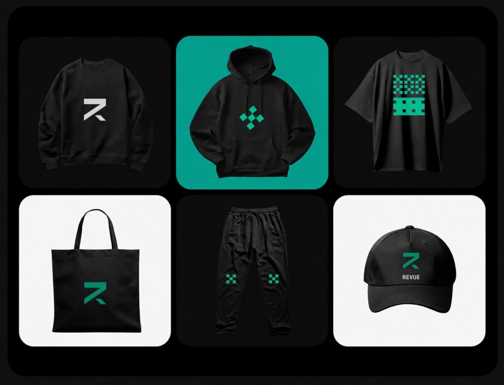
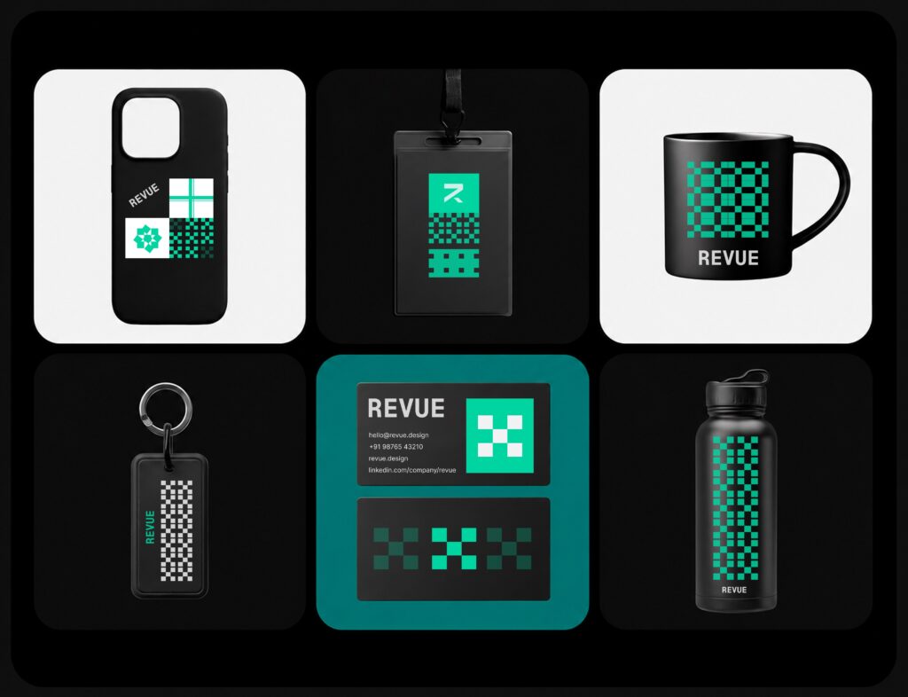
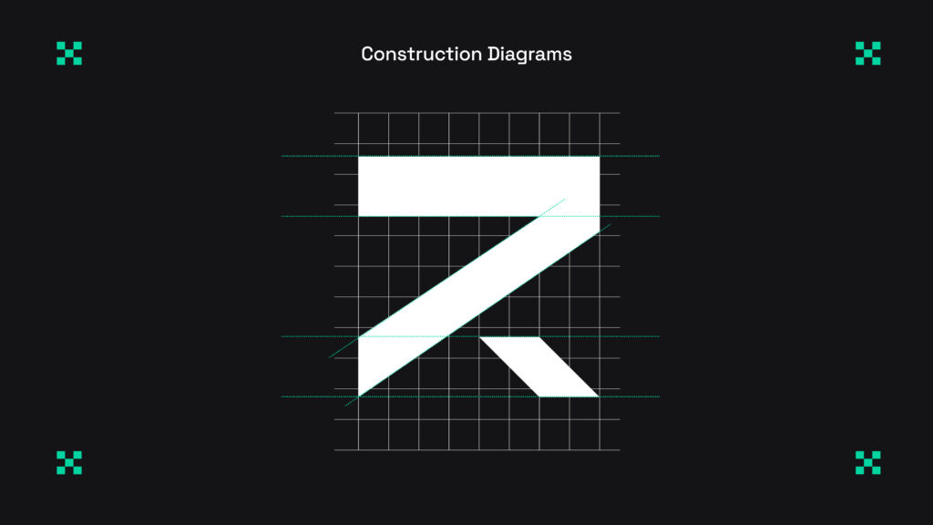
Sharp-corner logo system.
Teal verification badge inspired by passing tests and clean merges.
Structured typography and layouts.
Minimal visual noise.
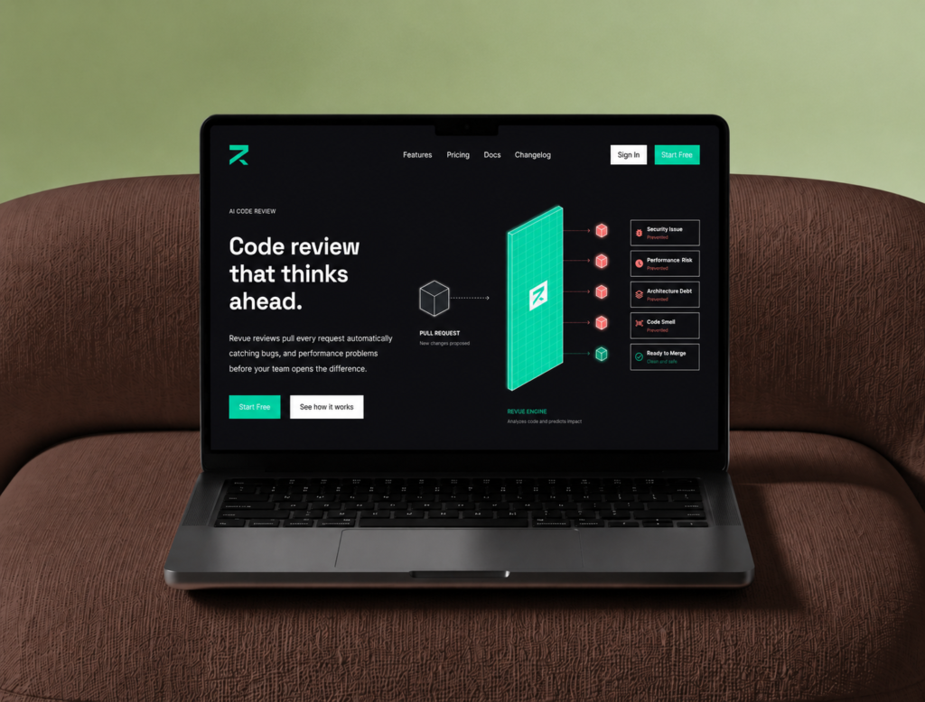
Instead of abstract AI graphics, the brand uses familiar developer elements:
Code diffs
Pull request interfaces
Review annotations
Red/green change indicators.
This makes the product immediately recognizable to its audience and strengthens credibility.
Deliverables
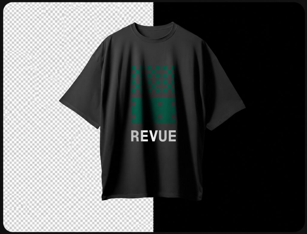
Logo system
Brand identity
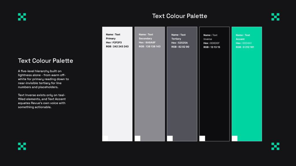
Color & typography system
Component library
Landing page (Desktop & Mobile)
Product UI mockupsBrand guidelines
Developer tools earn trust through clarity and proof, not marketing hype. Revue was designed to feel like a product built by engineers, for engineers.