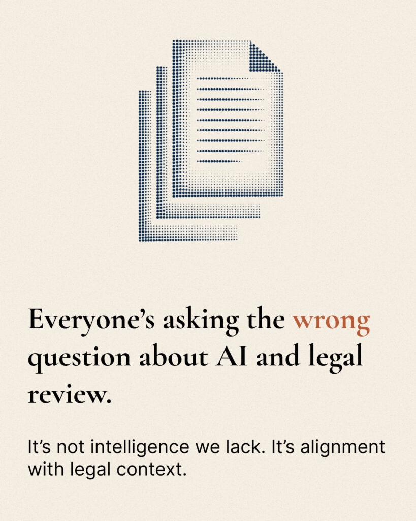
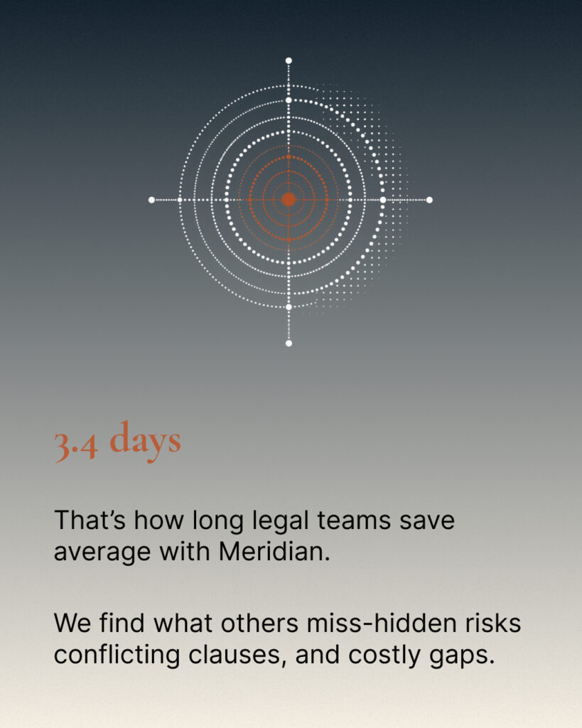
Every competitor leads with speed and capability. But the GC's real priority - confirmed in the brief - is accuracy first, confidentiality second, speed fourth.
Nobody in the category was addressing the professional fear: "what happens to my reputation if something gets missed."Three additional constraints made this difficult.
The brand could not look like a law firm (too conservative), could not look like a SaaS dashboard (no gravitas), and had to visually differentiate from Harvey's near-black-and-white, Ironclad's enterprise blue, and Luminance's dated navy-teal - all in the same move.
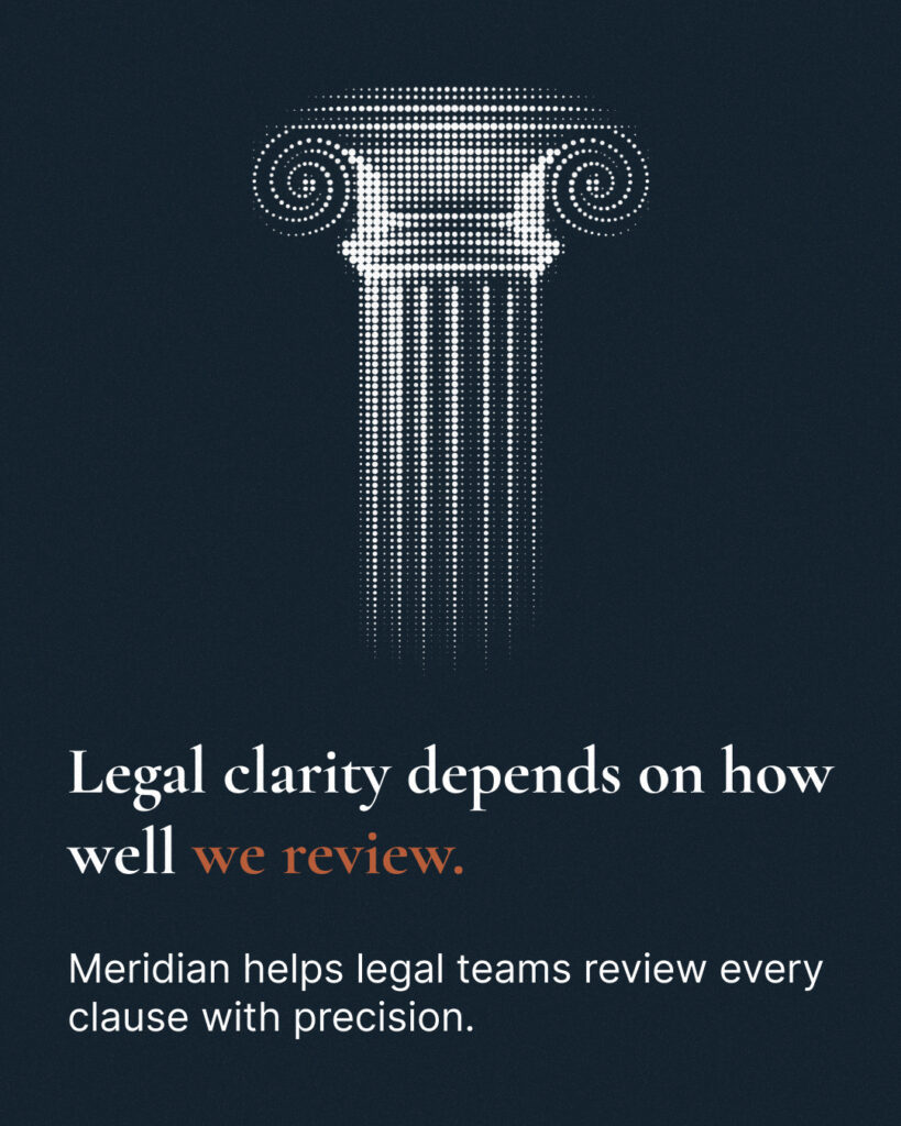
Three decisions defined the system.Lead with professional safety, not capability. The entire visual register - typeface, color, motif - communicates trust before copy confirms it.Occupy the warm color white space.
Warm cream (#F5EFE4), deep navy (#1B2A3B), and warm rust (#B85C38) have no owner anywhere in the AI legal category. The palette differentiates at a glance.Make the margin annotation the entire visual language.
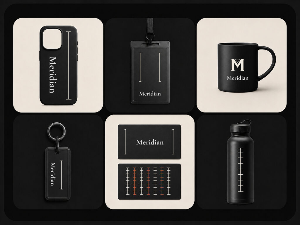
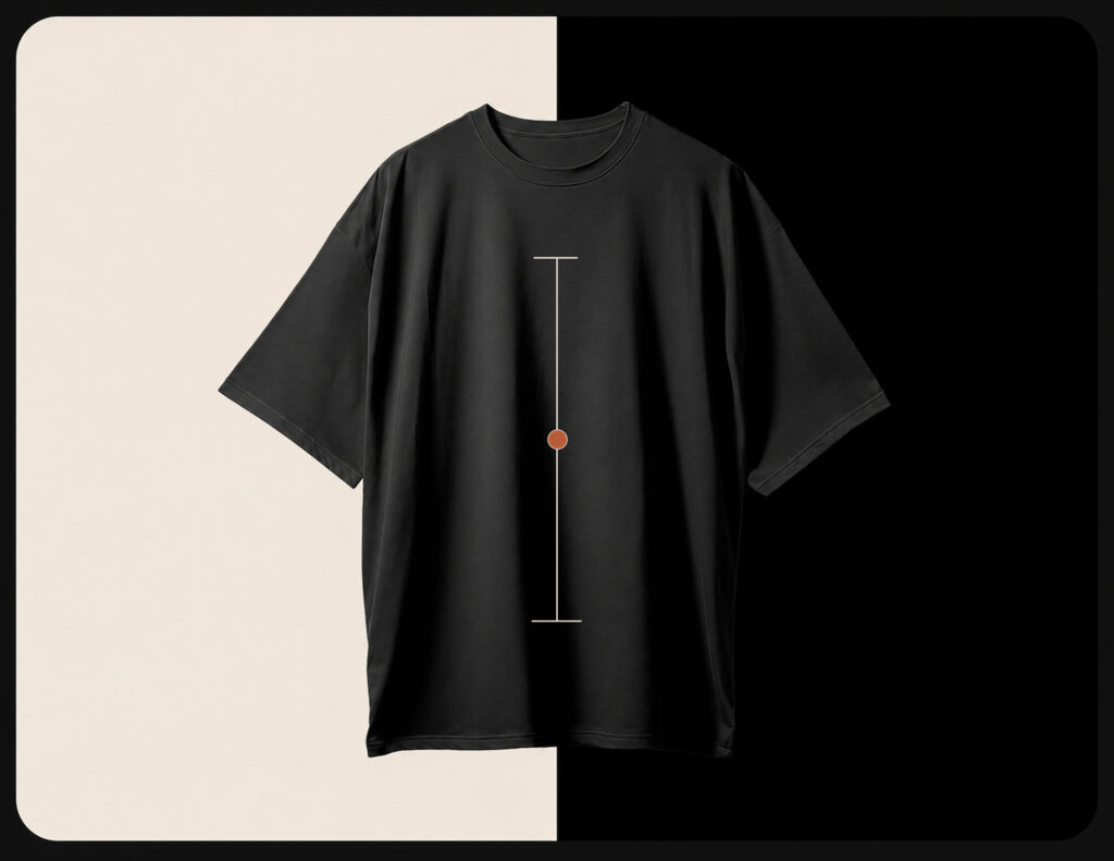
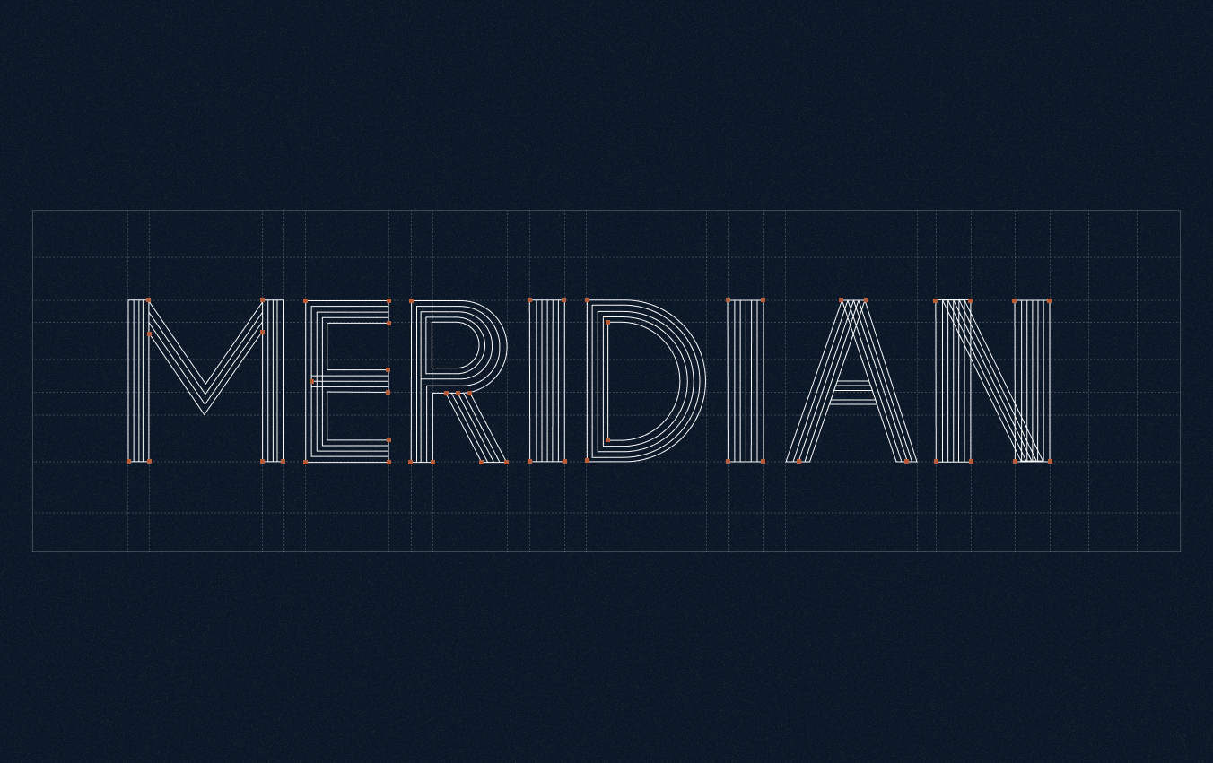
The vertical rule with a tick - the gesture lawyers have made in contract margins for centuries - becomes the logo, the card border system, the pattern, the section divider, and the hero layout simultaneously.
Where Revue uses red-removes and green-adds from a code diff, Meridian uses a three-tier annotation system mirroring the GC's actual decision framework:
This appears on every card in the product UI, on testimonial blocks, feature cards, and pitch deck slides. The brand and the product speak the same visual language - the annotation motif is not decoration, it is the interface.
Speculative project - no live metrics. But three brief goals can be verified.
Differentiation is immediate. A side-by-side comparison with all three competitors shows no visual overlap - the warm cream palette is completely unoccupied territory.Audience alignment is precise.
Cormorant Garamond references The Economist and Cleary Gottlieb - publications and institutions a GC already trusts.
The cream surface references premium legal paper.
Every decision borrows an association that already exists rather than inventing a new one.Positioning is clear.
The brand occupies exactly the gap the audit identified - between law firm authority and modern SaaS clarity, leading with professional safety rather than speed.
The competitive audit revealed the real brief. "Build a trustworthy legal AI brand" became "occupy warm color territory and lead with the professional fear no competitor addresses" - only after mapping what already existed.
The motif must come from the product's core action. The margin annotation works because it is exactly what Meridian does, rendered as a symbol. The visual identity does not illustrate the product - it is the product.
The buyer's fear is more useful than the buyer's desire. Every competitor leads with capability. Meridian leads with what goes wrong without it - and what that means professionally. That reframe is the most important strategic decision in the project.