Meridian
Making AI feel safe enough to trust with your professional reputation.
Client Name
Meridian ( Concept )
Service
Branding & Visual Design

Project overview
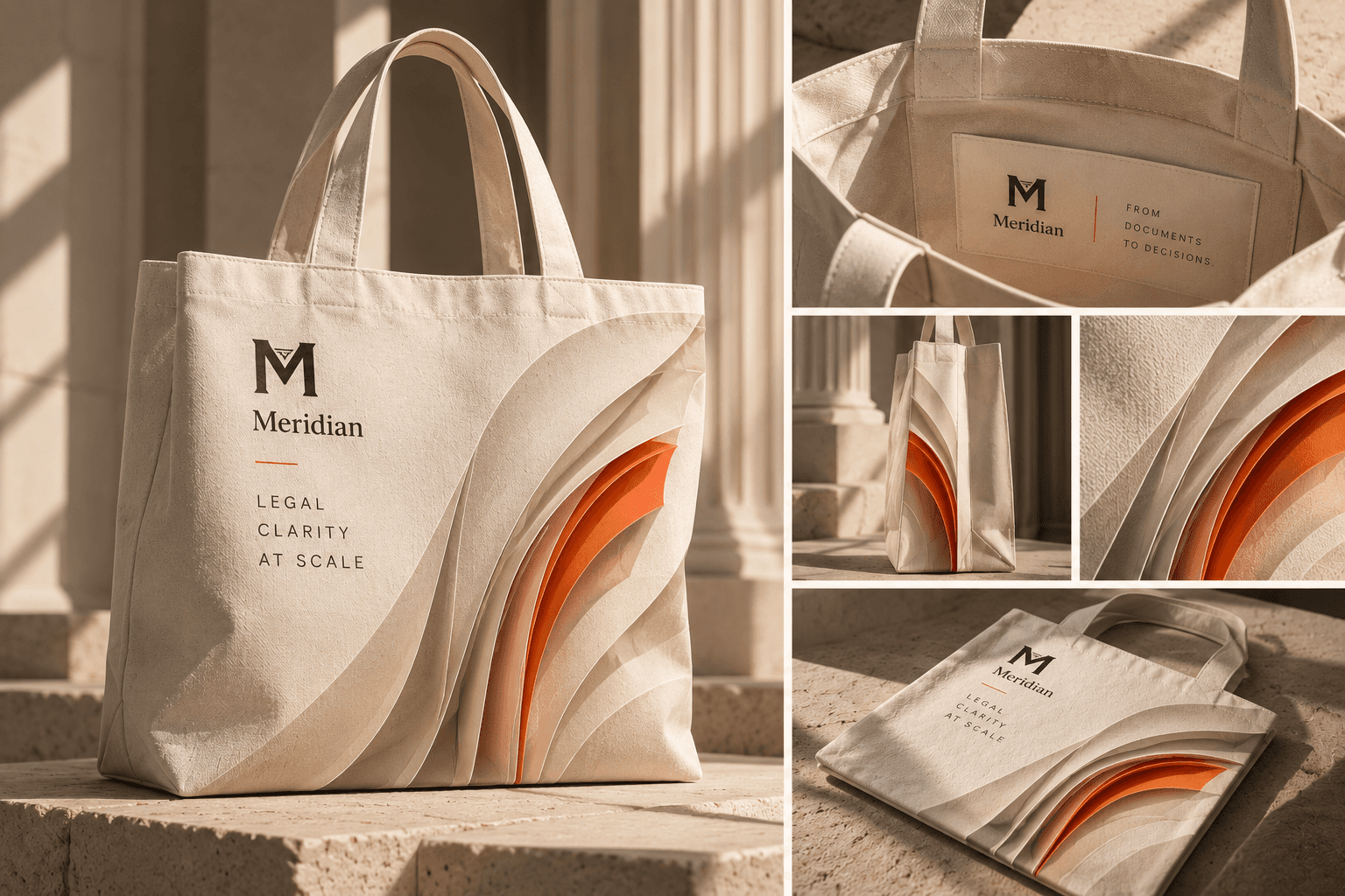
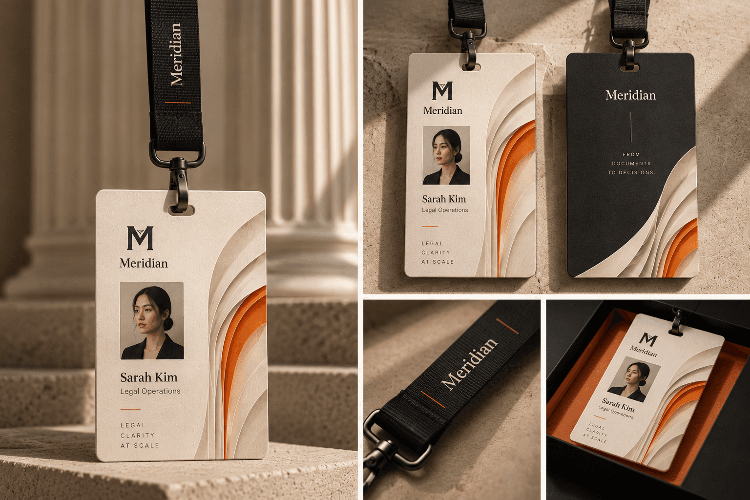
Meridian is a fictional AI contract review tool built for General Counsel and in-house legal teams at mid-size technology companies. The brief was to design a visual identity that earns the trust of the most risk-averse professional buyer in any industry – a lawyer who is personally accountable when something gets missed – before a single word of copy is read.
The Challenge
Every competitor leads with speed and capability. But the GC's real priority - confirmed in the brief - is accuracy first, confidentiality second, speed fourth.
Nobody in the category was addressing the professional fear: "what happens to my reputation if something gets missed?"Three additional constraints made this difficult.
The brand could not look like a law firm (too conservative), could not look like a SaaS dashboard (no gravitas), and had to visually differentiate from Harvey's near-black-and-white, Ironclad's enterprise blue, and Luminance's dated navy-teal - all in the same move.
The Solution
Three decisions defined the system.Lead with professional safety, not capability. The entire visual register - typeface, color, motif - communicates trust before copy confirms it. Occupy the warm color white space.
Warm cream (#F5EFE4), deep navy (#1B2A3B), and warm rust (#B85C38) have no owner anywhere in the AI legal category. The palette differentiates at a glance. Make the margin annotation the entire visual language.
The vertical rule with a tick - the gesture lawyers have made in contract margins for centuries - becomes the logo, the card border system, the pattern, the section divider, and the hero layout simultaneously.
Landing Page Link -